The Shared cM Project now shows your DNA match relationship possibilities in an easy-to-understand chart (a histogram) on the DNA Painter website. Here’s how it can help you build your genetic family tree—and a caution about TWO types of data in the DNA Painter tool.
Editor’s note: This article was updated and expanded on 9/01/20.
 The Shared cM Project (ScP) is an invaluable tool for genetic genealogists. It helps you see how the amount of your shared DNA with any given match translates into possible genealogical relationships.
It can be a lot to process and take in. For me, pictures always help. Enter the Shared cM Project histograms that were released as part of a recent update. Jonny Perl and Blaine Bettinger have integrated these into the Shared cM Project 4.0 tool v4 at the DNA Painter website.
Using the Shared cM Project 4.0 v4 at DNA Painter
At the Shared cM Project 4.0 v4 on the DNA Painter website, you can enter a shared cM value with one of your matches. This will generate your genetic relationship probabilities, based on statistics provided by Leah Larkin (the DNA Geek). (Before running the tool, click “Beta with updated probabilities” on the left side to apply the brand newest data—if that option isn’t there any more, I’m guessing the whole tool has been completely updated.)
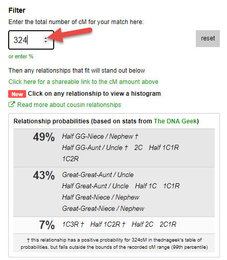
As you can see, with this shared cM count, it’s 49% probable that you have one of the relationships listed in the first box, but it’s also 43% probable you have one of the second set of relationships, etc.
Shared cM Project Histograms at DNA Painter
Now, on to the visualization of your relationship probabilities: the histogram. A histogram just is a fancy word for a chart that can convey a bunch of information all at once. If you can read a chart (and you can), you can read a histogram.
Especially if I give you this quick brush-up from your high school math class (sorry-not-sorry). Remember the “bell curve?” It’s a shape that many kinds of results take when you diagram them out. If the curve below were reporting average test scores, for example, about 70% of them would fall within a “most-reported” range, with another 14% or so falling within a second-most-reported range on either side of that 70%, and then there would be a few scattering “outliers.”
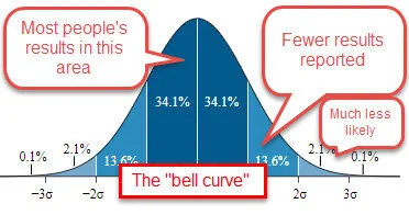
This graphic has been adapted from “Normal distribution curve that illustrates standard deviations,” by M.W. Toews, based (in concept) on figure by Jeremy Kemp, on 2005-02-09. Wikimedia Commons image, used under Creative Commons Attribution 2.5 Generic license.
Now back to the shared DNA histograms. Scroll down to the relationship chart, which will show the genetically-possible relationships for the amount of shared DNA you entered. Click on one of the possible relationships:
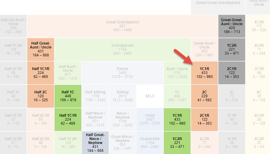
This generates a histogram, like the example below for the 1C1R relationship probability for 324 shared cM. (Glance down: see the bell curve, the imaginary line connecting the tops of the blue bars?)
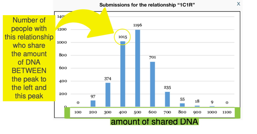
This histogram shows us all the data collected by the ScP for DNA matches whose genealogy says they ARE first cousins once removed (1C1R). The numbers running along the bottom of the chart reveal ranges for how much DNA was shared by these 1C1R, starting at zero cMs and going all the way up to 1100 cMs. The numbers going up the left side help us see how many people are falling into each category. The exact number is written at the top of each of the blue bars (peaks). For example, 1015 individuals report 1C1R relationships that share between 301-400 cM. Make sense?
So how do we use this chart? You can see that the amount of DNA you share with this match is comfortably within the range of frequently-reported results for 1C1R. That’s helpful to know when trying to determine how you’re related to this match.
Of course, this is only one data point. The histograms become more powerful when you’re using them to look at trends. For example, let’s say you are thinking you might be a descendant of Donavan Waters and his wife Andralene Frisco. If this is true, three of that couple’s documented descendants who have been tested (and appear as your DNA matches) would be your 1C1R.
When you look at the chart, you see that the amount of DNA you share with each of these cousins falls consistently toward the left side of the chart, rather than in the middle. In other words, you’re consistently sharing less-than-typically reported amounts of DNA with all 3 of them for a 1C1R relationship. While you are technically sharing enough DNA to be connected at this couple, you may want to consider that you share a more distant relationships with these matches.
A caution: TWO Sets of Data
If you’ve been reading this article carefully, you noticed that I mentioned two different sets of data behind the Shared cM Project 4.0 v4 tool at DNA Painter: the statistics from DNA Geek for the percentages and user-submitted data to the Shared cM Project for the histograms:
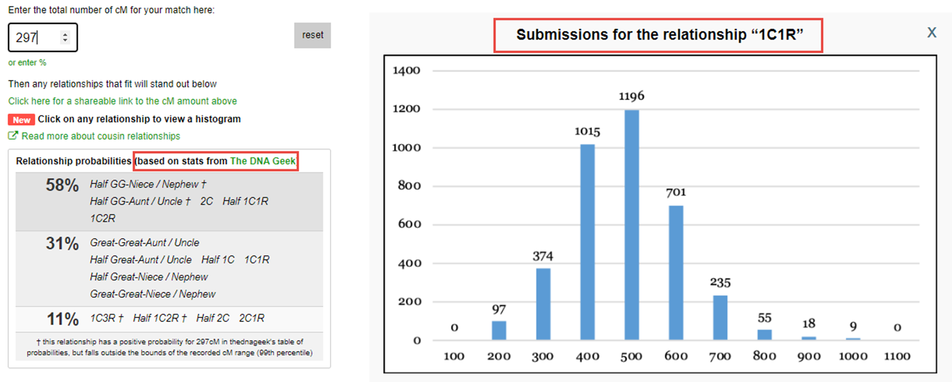
Both sets of data are valuable, but may provide you with slightly different pictures of your relationship probabilities in different scenarios. Use them both. Preferably, as I mentioned, by running lots of shared matches numbers and watching for trends.
Contacting DNA Matches
Understanding how you might be related to your DNA matches is only the first step. Sometimes the most valuable information you can get will come from reaching out to your matches. Check out our free download for our best tips on how to contact your DNA matches!

